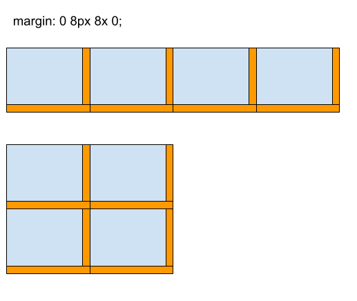
So I have been frequently frustrated when doing CSS flexbox, in particular, my margins, which may look good on a wide screen suddenly look awful as the screen narrows. Instead of using media queries to change the CSS on narrower windows I began to wonder if I was just missing something basic, so I took some time to back up and think about the problem in general, and I can up with the following default system:
margin: 0 8px 8px 0;
The idea is to only set equal non-zero margins on the right and bottom of every element and zero width margins on the left and top of each element. As you can see no matter what size the screen becomes the elements will always have the same margin between them. This works even if the elements are different sizes.

I’m sure I haven’t invented anything new here, and if anyone knows a name for this please let me know in the comments.
 Joe Gregorio