 Joe Gregorio
We need to talk about Shadow DOM. While the Google official docs strongly encourage the use of Shadow DOM, I quite strongly disagree.
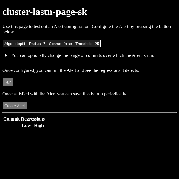
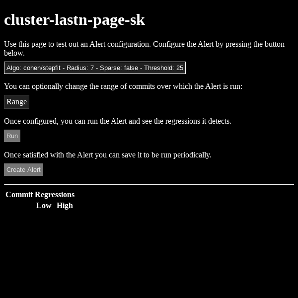
As an example, a couple weeks ago I realized I could style the <summary> part of a <details><summary> set of elements as a button, which would
look great and more readily indicate its function. You can see the improvement here:
Before:
After:
Thankfully I hadn’t swallowed the party-line on Shadown DOM and this is the full set of CSS changes I had to make, just the following additions:
details {
  summary {
    display: inline-block;
    outline: none;
    padding: 4px;
    background: var(--surface);
    color: var(--on-surface);
    border: solid 1px var(--surface-1dp);
    cursor: pointer;
    list-style: none;
    margin: 8px 0;
  }

  summary::-webkit-details-marker {
    display: none;
  }
}

details[open] {
  border: solid 1px var(--on-surface);
  padding: 0 8px 16px 8px;
  background: var(--surface);
  margin: 8px 8px 8px 0;

  summary {
    margin-top: 8px;
    margin-bottom: 8px;
  }
}
Note that this Style change Cascaded across three controls, almost as if
that’s what CSS was designed to do. If I had fallen into the Shadow DOM trap
I would have had to change the embedded CSS for every element that used
summary and details, and that’s not even mentioning the performance
penalty I’d pay. So
please think twice before adopting Shadow DOM.